

*MAGAZINE GENRES

5 Types of magazines and the highlights:
TECH MAGAZINES:
Tech Magazines connects and updates the world about anything to do with technology + science. They are contain tech reviews, and news, articles, tech trends, digital information and so much more.
There are tech magazine companies such as BizTech (an American based digital magazine), and BBC Science Focus which is a British based magazine both digitally and printed; there are numerous more.
Apparently more men than women read magazines on tech. Tech magazine companies like WIRED target their content at 30-50 year olds.
CHILDREN MAGAZINES:
Children Magazines offer entertaining content and activities for kids. They also advertise other kids toys, shows and giveaways to keep the kids interacting.
You can get magazines for any age of any kid, some are 3-7 and some are 8-12
FASHION MAGAZINES:
Fashion Magazines like popular VOGUE, Cosmopolitan, Elle and Vanity Fair are devoted to offering content surrounding fashion, accessories, outfits, the latest clothes complete with stunning photographs etc.
Fashion magazines like VOGUE have a wide audience of females round the ages of 17-29 year olds.
COOKING MAGAZINES:
Cooking Magazines offer content devoted to cooking, meal preps, food facts, recipes etc.
Their target audiences are towards children to adults of any gender and ethnicity to participate. Depending on what culture food their dong however, or if its just a. general cooking/recipe book
ANIMAL MAGAZINES:
Animal Magazines offer interesting content about animals and the wildlife for animal lovers of literally any age. However some animal books are worded n a way that kids may not understand. You also get kids animal magazines.


What is a 'genre'?
A genre is a category/ a style of artistic, literacy, musical, grouped with similar elements.

What is a 'magazine'?
A magazine is a printed or digital publication containing updated content for the public.
The difference between PRINT + DIGITAL magazines:

The difference between print + digital magazines is that printed magazines are magazines that contain content physically on paper with printed text and photographs. These are found in almost every shop you go to, even on public transports sometimes for free. Digital magazines are found online on an electronic smart device and come with a variety of features and elements that printed magazines do not have. The features that digital magazines have that printed magazines don't are animations, links, videos, audios, and multiple other interactive things. Also its very convenient and easier to access.
Magazine categories:


Magazines are grouped into categories, it makes it easier for people who are looking or a specific topic/subject or interest. Here are a few:
* Fashion Magazines
* Children's Magazines
* Health Magazines
* Tech Magazines
* Cooking Magazines
* Art Magazines
* Business + Finance Magazines
* Lifestyle Magazines
* Gossip Magazines


*MAGAZINE GENRES
Defining the intended market for each chosen magazine:
TECH MAGAZINES:


• Demographics:
The tech magazines demographics, i'd say, are british wealthy white men at age 18+.
• Psychographics:
Ambitous and curious people who are eager for new information are more likely to read and enjoy these types of magazines. Their most likely to be a student studying science or in a career that is tech/science based. They typically are introverted people as they much prefer spending time alone researching and discovering and are very resilient.
• Geographics:
Tech magazines are usually international as tech is the mostly the same all around the world.
CHILDREN MAGAZINES:


• Demographics:
The children's magazines demographics are typically for kids usually from 3- 12. Most magazines target audience are towards British white young girls, but this chosen magazine is targeted to both girl, boys and kids of any race because its just a cartoon of an animal and no human kid can relate to it in regards to that.
• Psychographics:
All creative, pure and imaginative kids will enjoy such magazine. Kids that love to play will most likely love the items that come with the printed version.
• Geographics:
Peppa pig is a British show so this chosen one is a national magazine.
FASHION MAGAZINES:


• Demographics:
The fashion magazines demographics are typically for women usually from ages 16-40. They're intended market, for this particular magazine, is towards middle class women of colour.
• Psychographics:
Classy and creative black women who are interested in fashion and makeup may be the target audience for this magazine. They may lean more towards the extroverted side, I say this because the colours on the front cover are loud and bold. They could be enthusiastic types of people who see no limits when it comes to style and makeup.
• Geographics:
This is an international magazine because fashion is everywhere.
COOKING MAGAZINES:


• Demographics:
This cooking magazines demographics are most likely for women, 12+, since cooking is associated with females although it could also be for men. This is a carribean food magazine so the market is to attarct the eyes of carribean people of an income.
• Psychographics:
People who like this magazine, most likely love to cook. They love to learn and try new things. They like to prepare food for others swell as themselves. They also are quite traditional and food is important to them.
• Geographics:
This is a regional magazine as Jamaica is apart of the carribean region

*CODES & CONVENTIONS
ANIMAL MAGAZINES:


• Demographics:
This animal magazine is for both boys and girls of any age Andy income because its family friendly and interesting.
• Psychographics:
The intended market is for people who love animals, who have a caring heart and empathise with them alot. Also for people who are looking for pets. They probably love every other animal based things and content. They could be adventurous or want to be. They probably have a pet already, had one or is looking for one.
• Geographics:
This is an international magazine.
Conventions Diagrams:


*PLATFORM CONSIDERATIONS
5 Benefits and Limitations for Digital Magazines in comparison to Printed Magazines.
DIGITAL VS. PRINT
COST:
BENEFITS:
LIMITATIONS:
BENEFITS:
LIMITATIONS:
The benefits of digital magazines in comparison to printed is that it saves a lot more money due to the fact that you do not have to pay for the cost of things. Digital magazines are easier to access and can be used anywhere on any electronic device.
Even-though the cost for digital magazines is much less than printed, the Limitations are that they would have to invest in new features, effects, softwares to be able to continue this.
A benefit of the cost of printed magazines is that your able to actually have a physical copy of it, it can be shared and handed over to each other too.
The limitations/disadvantages of printed magazines that it can be quite expensive in cost. The delivery has a cost and so does the print itself.
BENEFITS:
DIFFERENT DISTRIBUTION CHANNELS:
LIMITATIONS:
BENEFITS:
LIMITATIONS:
It is significantly easier to create and distribute a digital magazine online and easier to find.
The benefits of different distributions with printed magazines is that theres
A limitation of digital magazines with different distribution channels is the cost to promote and send to other pages. Also because of how accessible it is, theres a chance that it could be found for free online instead of being paid for or subscribed too.
The limitations is that it could take longer to create and distribute especially since, unlike having a digital magazine, your unable to edit once distributed. So it all takes much more time.
OPPOTUNITIES TO ADDRESS TARGET AUDIENCES:
BENEFITS:
LIMITATIONS:
BENEFITS:
LIMITATIONS:
The benefits of the oppotunities digital magazines are able to address their target audiences is that its easier to remove and allow parts of the public that don't meet the requirements. for example if their target audiences are for 18 year olds, they can get rid of anyone whose not that age.
The limitations of opportunities to address target audiences is that, some people can still get away interacting with the content although they're not apart f the target audience. Its easier to get away with things online
The benefits of the opportunities that printed magazines addressing their target audiences is that only they can be able to but those magazines. Also from the front cover it is very easy to see what kind of content that a magazine contains. and from the captions and titles.
The limitations are that some people may find content made for a specific audience, offensive, unreliable or inappropriate because of how accessible it is. Because of this it is easier for magazine companies to get reports about these issues and complications even if their aren't necessarily valid.
LIMITATIONS TO ADDRESS TARGET AUDIENCES:
BENEFITS:
LIMITATIONS:
BENEFITS:
LIMITATIONS:
The benefits of the limitation that comes with addressing target audiences is that it is available to any type of audience.
The limitations are that many different people could stumble upon it and dislike it.
The benefits of the limitation of addressing target audiences for printed magazines is that, the magazines made by a company would be known for this and would have free consumers reading different types of magazines.
The limitations for printed magazines is that it can become quite disorganised between audiences.
BENEFITS:
TECHNICAL REQUIREMENTS:
LIMITATIONS:
BENEFITS:
LIMITATIONS:
The benefits of technical requirements for digital magazines is that you don't really need any. All you need is an internet connection and a device to get started. Also other apps and webs to get creative with it and to customize it however you want.

*PLATFORM CONSIDERATIONS
Reviewing and summarising this Guardian article:
The Link for the Article :
Overall this article is about how nowadays in comparison to a few years back, the magazine sales paid in total has gone significantly low; this is why the title is called "How the British fell out of love with magazines". Digital magazines and other competitors such as YouTube and Netflix, has gained major popularity overtime because it's easier to access and cheaper to buy. For digital magazines including other applications and sites, all you need is an internet connection and an electronic device to get started anywhere at anytime.

This Graph shows the total paid for UK magazine sales that fell to 418m in 2018. The graph clearly displays the decrease in the sales from 2005 to 2018, so in the space of 13 years
As you can see the sales in 2005 were fairly high, at around 1.2Bn. The sales in 2006 were also very high, if not highest with around 1.25Bn. The sales then slowly dropped and reached 1.0 sales in 2010, 0.8 sales in 2012 and around 0.4 sales in 2018. According to The Guardian, some magazine company's even closed down.
Magazine companies like NME stopped printing because of this situation predicting that this will all only get worse. A Chief executer named Douglas McCabe had a-lot to say about this issue saying that it will only get worse and that with social medias like Instagram, Facebook etc, it is less likely that in years to come magazines will have hardly any sales. Nowadays people are used to picking up their electronic devices packed with all sources of entertainment rather than a printed magazine.
However Mr McCabe did say theres a brighter side to all this and that there are some things online offerings fail to offer unlike big companies like Tv listing magazines including Tv Choice.
McCabe said “In terms of TV listings their resilience is because there still isn’t anything out there online that is better,”.
This Graph backs his point highly.
It's clear to see that TV Choice is still popular with around 1,000 + copies sold per issue from January to June in 2019. Unfortunately, according to this graph, Saga Magazine got only around 200+ copies sold per issue which is a huge difference to TV Choice. But either way these 10 UK magazines are apparently the Top 10 Bestselling ones.

Mr McCabe said that these titles and others are very popular for the way they've been invested in. They are easier to find in important channels like Super markets etc.

LAA:
Textual Analysis':
PRINTED FASHION MAGAZINE -
FRONT COVER:

Above we have a fashion magazine and this fashion magazine follows the common conventions of a typical fashion magazine. This is because firstly most fashion magazines look very trendy and modern and this is because its always promoting fashionable outfits and pieces etc.
There is a big and bold masthead at the top, like in many other fashion magazines and it fits the overall colour scheme of the magazine. Fashion magazines like to prioritise the colour schemes used and specifically choose certain colours to communicate a message to their consumers. Its the colour of the sand and the colour of the ladies skin, their trainers and top. This colour scheme, of creams, beiges and nude, is quite consistent throughout the magazine, even with the coverlines helping to create appeal and style. Creams, beiges and nude colours connote elegance, calmness, comfiness and simplicity and these are the vibes we get looking at the colour schemes used for this magazine. It evokes relaxation and doesn't command attention unlike colours like red, orange and pink.
In regards to the pose of the models, it's very common to see that in most fashion magazines. They have very serious facial expressions and their sat on the sad with legs wide. The guys NVC suggest that' he's comfortable and confident as his posture is very open, facing ahead, however the posture of the lady slightly contradicts that as her posture is quite closed. Her arms are more closer to each other as opposed to the mans arms making her appear less confident and friendly especially since her body faces the side rather than straightforward. Her facial expression looks quite focused and attentive, though, as she looks ahead like the man. Together they've got good postures and they're not slouching.
The camera angle is in medium long shot as their full body is in frame and not much of the background and excluding their feet. This draws attention to their outfits quite a lot fitting the overall colour scheme.
The typography used is the Serif/Didot font which is the standard and commonly used in popular fashion magazines. It gives off an elegant, conventional, classic feel to it which is easy to read and recognise. This font is used for the masthead only in the same cream/beige colour to match the sand and their outfits. The rest of the text are in basic bold fonts mostly in white.
This magazine could appeal to people who like fashion and colour coordinating, maybe to both young males and females. The choice of outfit chosen for the models is something maybe a younger audience would like and so id say its targeted towards 16-25 year olds.
I would say this magazine fulfils its intended purpose of being one from the fashion genre as it follows the common conventions.
PRINTED ART MAGAZINE -
FRONT COVER:

The art magazine above follows the conventions of the typical art magazine, of today. This is because of the layout, main image choice and typography. This is a very simple art magazine as its not as colourful and extravagant as most art magazines, deliberately done to express and display creativity as much as possible and to be easily identified for other magazine genres.
The main image is of a painting of a man in medium close up shot. The man has blue eyes(looking straight ahead), ginger hair and very pale skin. All the shadows and darker areas of his face have been layered on, helping to show where the lighting would be if this was a real photograph, and the direction his head faces which is to the left.
The background of is mostly light blues and a series of greyish, dull colours. Grey is a still, emotionless colour, representing neutrality and intellect. The colours used, match the mood shown on through the mans facial expression; He looks quite reserved and serious.
The typography style is very simple for the masthead. The font used is rounded looking very similar to the Orborn font which is a modern round font family that can be used to give a clean look for logos, titles and headlines. They're all in lowercase and the word "art" is in bold whereas the "of England" part is thinner. The purpose of making the word art bold is to capture their target audiences attention as it is the most prominent word on the whole front cover page. Anybody who likes art and creativity will be drawn to the magazine and then the rest of it. The main coverline uses the Oswald Regular font which is a classic font like the Serifs. Its very simple and quite serious looking. The main coverline is typed in all capitals adding extra strength onto the message of this text and the weight. Every piece of text on the front cover is in white and doesn't use any types of shadows, glows or bevels. White is an effective colour to use for text as nothing on the page is pure white and it implies cleanliness, purity and perfection.
This art magazine definitely is effective in appealing to their target audience. Their target audience is towards artistic people or people curious about creative skills in search of inspiration and/or entertainment. Anybody of any age could have access to this type of content as its generally family friendly and it looks pretty age inclusive. Females are known to be more interested in the creative field as opposed to males so it'd be more likely that more females to males would read this.
This magazine fulfils its intended purpose because ts appealing to their target audience and its very nice to look at.
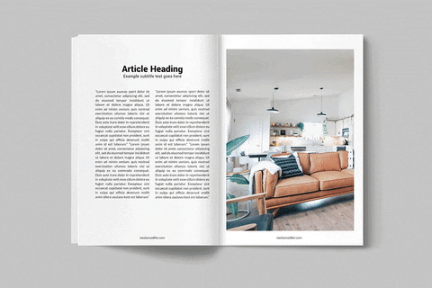
DIGITAL ANIMAL MAGAZINE -
DOUBLE PAGE:

This double page children magazine looks like the typical animal magazine. The target audience looks like its designed to appeal towards ages 3-16 because of its playful and childlike layout, fonts and columns designs. I'd say this is for both male and females who are young and are particularly adventurous and curious about animals and wildlife.
Firstly the whole magazine is in the colour orange which is frequently used in most children media content. Orange is a colour that draws attention right away, it is a joyful, warm, enthusiastic colour and for kids it gives feelings of friendliness, extroversion and fun. On top of that there is the main image which is a sticker PNG of a cute, adorable hedgehog mid page looking ahead. It is the largest photo there and around it there's bunch of information and interactive content.
The subject name at the top left in a white chalkboard font all In capital letters. It Is a very visually pleasing font that imitate kids handwriting and connotes school and learning. The rest of the fonts used are very simple. headlines are slightly bigger and bolder than the columns themselves and so is the strap line.
Throughout the pages of this double page magazine, there's a few small images of different animals as each column talks about different things. Moreover there's a little quote in a speech bubble under its nose coming from the big hedgehog which helps activate the kids imagination.
This double page children magazine is engaging and grabs the attention of children very well because of its bright colour choices like red, orange, green and blues. Also due to its easy fonts and layout. It is very clear that this is also an animal magazine; a magazine for kids that love animals and want to learn more.
DIGITAL COOKING MAGAZINE -
DOUBLE PAGE:

The double page conventions diagram for this cooking magazine above shows that it follows the common conventions of a typical cooking magazine. This magazine appears to appeal to people who love cooking and who are interested about learning new recipes of any age. This is likely to grab the attention of any gender however its most likely that this will reach more of the female audience. This isn't just any cooking double page though as it lets the audience in to fun sweet treats for the winter period so this could also appeal specifically to kids as they have a sweet tooth more as opposed to older adults.
The colours used in the magazine are dark browns, greens and reds, conveying feelings of the warmth and comforting feeling needed especially for that winter period. Dark green is another relaxing colour conotating nature and tradition. The colour dark red radiates passion and energy and its a colour that is widely known for grabbing attention. The texts are just white which most definitely stands our from the background and the other images on the pages.
The fonts used are Oswald as they are very simple, long, modern fonts used that give of a serious feel. It's used for the heading and the little headlines. Every heading and headline one the pages are written in capital letters to paper bolder and stand out. Each recipe is in white. The rest of the text in the columns are in serif and are in white. This is because this magazine is full of recipes, there are a lot of bullet points used and mini headlines to redirect the instructions.
This Magazin is very effective at grabbing its target audiences attention. It clearly states what recipe its showing, an image and ow many servings it has to offer. The colours are bright but dark and calming and the layout is fun and very clear.

*SOURCE, LOG + GENERATE APPROPRIATE CONTENT:
- GENRE PROFILING:

- POSES + COSTUME:
4 Common Poses in R&B:
Lying on their side:


Serious and stood straight:


Ive noticed that one of the most common poses that RnB artists do is lie on their side.
Both females and males do this
In the RnB genre, artists, especially the females, tend to look ahead with some serious or seductive eyes. Sometimes in the magazine its in closeup, sometimes midshot.
Arms crossed, hands linked:


Its common to see the artists of the RnB genre, fold their arms. It connotes power and authority. Or they hold their own hands.
Side Profile:


Its really common for the artists to have a shot of their side profile.
This is done either in close up or mid shot.
4 Common Fashion styles in R&B:


Every genre has their own conventions in regards to something and in the RnB genre in regards to fashion styles it certainly is not limited.
I found that RnB artists tend to switch it up bit. Some are sporty fashion styles, some casual and some streetwear. They tend to wear alot of baggy hoodies, tops and trousers. They also wear sunglasses and trainers. Overall artists within this genre tend to go for a 'cooL' aesthetic.
Sometime the females wear tight clothing, however. Like tight, skinny belly tops and skinny hip jeans or flares. The females in RnB, especially in the 90s, were hardly seen to wear dresses or skirts. Most of them would be dressed like a 'tomboy.
Men of this genre don't really wear anything 'skinny', especially in the 90s. Most of the time it's perfectly fitted or oversized.
- AUDIENCE PROFILING:
Fictional male and female profiles of my perfect magazine readers for my new magazine:
*PREPARING CONTENT IN APPRORIATE FORMATS:
- AUDIENCE PROFILING:
Typography boards for:
• Mastheads
• Main Coverlines
• Coverlines
Mastheads
Main
Coverlines
Coverlines
In magazines, the mastheads in the RnB genre are typically big and bold, as seen in my typography board.
Normally its in normal big fonts but sometimes in stylistic funky fonts that make it stand out and look different from the rest.
The main coverlids in RnB magazines are bit more less serious looking as in there a different use of fonts and colours. Its mainly in red, though, yellows and oranges.
Basically warm colours
The regular coverlines are usually in a simple font. They usually follow a colour scheme that makes sense and matches the main coverlines and the colour scheme of the overall magazine. They're usually the smallest bits of info on the page.
- DRAWN DRAFT:
Two front cover & two double page drawn drafts:
Front covers :


For my drawn drafts I tested to see if I wanted to do a male or female artists so I drew both.
I decided later on to do the female one since I had so many ideas for it. I wanted my magazine to have a medium close up shot of their face with their name at the bottom and the mast head big and bright at the top.
I knew that id have to think of my masthead properly so I want just going to make it 'RnB. I am proud of these drawn drafts.
Double Page :
- DIGITAL DRAFT:


Front covers :


For my Digital draft design I made sure to copy some ideas of my drawn drafts and place it wherever I wanted through my digital.
I know that I wanted her name big and bold and a picture of her standing straight ahead with the poses that a typical RnB artist in a music magazine would have with coverline of the latest gossips on the side that further speak about the magazine and the content inside.
I wanted a bold statement of a quote that Rosa Moon so that it can spark more interest and get the viewers to read on.
Double Page :
For my Digital draft design for the Double Page, I made sure to add a quote, a main image, the text paragraphs, the heading and the other images.
I chose the 2nd design instead of the first because I loved how I put her first name on the first page and the last name in the 2nd page.
I knew that I had to make the first letter of the paragraphs like even double page article.


Location Recce:
ON-SITE PHOTO SHOOT :
OFF-SITE PHOTO SHOOT :
Photos from the on-site shoot:


Photos from the off-site photo shoot:


LEARNING AIM B:
*LAB:
A PRESENTATION of evidence for my music magazine pre-production work:
LEARNING AIM C:
*LAC:
- FINISHED MAGAZINE
FRONT COVER:

- FINISHED MAGAZINE
DOUBLE PAGE:
